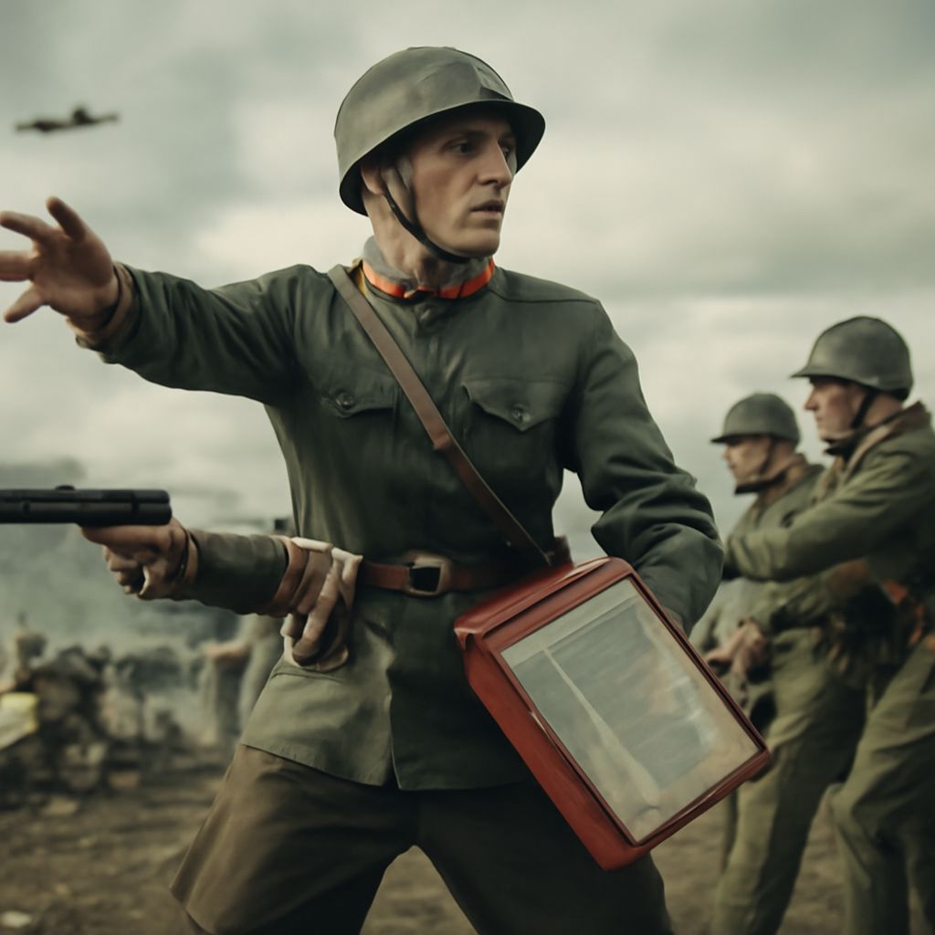
A soviet poster, a World War I recruitment print, and a WWII home-front design could all turn crisis into action, but they did not speak for the same sponsor or audience. Together, these world war propaganda posters show how political systems chose different visual tools.
A soviet poster often fused revolutionary identity with labor, class struggle, or military service. By contrast, many World War I campaigns sought army recruits, while World War II campaigns also managed factories, food, secrecy, and civilian morale. The key comparison is who commissioned each image, whom it addressed, and what action it demanded.
World War Propaganda Posters in World War I: Kitchener, Uncle Sam, and Home-Front Appeals
Alfred Leete’s 1914 poster, Britons (Lord Kitchener) Wants You, was distributed through Britain’s Parliamentary Recruiting Committee. Its audience was men eligible for military service. Kitchener’s direct stare, pointing finger, and short imperative made enlistment feel personal, urgent, and morally binding.
James Montgomery Flagg’s I Want You for U.S. Army, issued for the American army in 1917, adapted the same direct-address method. Uncle Sam’s pointing hand, white beard, and red-white-and-blue clothing turned national identity into a recognizable human figure. Large block lettering made the command readable from a distance.
World War I posters also addressed civilians. The U.S. Food Administration’s Food Will Win the War linked household conservation to military victory. Its patriotic figure and emphatic headline told consumers, especially those managing food at home, that saving wheat and other supplies was a form of service.
Soviet Poster Themes and Styles: Moor, ROSTA Windows, and Revolutionary Labor
Dmitry Moor’s 1920 Have You Volunteered? was created for Soviet military recruitment during the Civil War. A Red Army soldier points outward beneath a stark red-and-black design. The sponsor sought volunteers, while the image presented service as a defense of the new revolutionary state.
The ROSTA Windows, produced by the Soviet state news agency from 1919 onward, used hand-painted panels, simple drawings, and brief captions. Artists including Vladimir Mayakovsky addressed workers and urban readers with news about production, shortages, military threats, and revolutionary duty. Their sequence-like format worked for audiences with different levels of literacy.
Labor became a major theme in later Soviet campaigns. Posters celebrating Five-Year Plan targets or Stakhanovite workers were sponsored by party and state institutions and aimed at industrial laborers. Photomontage, diagonal lines, oversized red typography, and physically powerful workers made production resemble a heroic collective battle.
WWII Poster Campaigns: Rosie, Keep Calm, and Careless Talk
One clear example is a wwii poster: J. Howard Miller’s We Can Do It!, made for the Westinghouse War Production Committee in 1943. It addressed female employees in company factories, not the entire nation. Rosie’s rolled sleeve, flexed arm, blue work shirt, and yellow bandana presented factory labor as capable, disciplined, and patriotic.
The British Ministry of Information commissioned Keep Calm and Carry On in 1939 for civilians facing invasion or bombing. Its crown symbol, restrained red background, and centered sans-serif type projected authority without showing a battle. Because it was held in reserve and rarely displayed during the war, its later fame exceeds its original public reach.
Careless Talk Costs Lives, also produced by the Ministry of Information, warned civilians and service personnel against revealing military information. Fougasse’s cartoon versions used speech, overheard comments, spies, or listening ears to make an invisible enemy visible. The call to action was silence rather than enlistment or production.
Comparing Symbols, Heroes, Enemies, and Calls to Action
The three traditions differ first in sponsorship. World War I posters commonly came from recruitment committees, armies, or food agencies. Soviet examples came from revolutionary authorities, state news bodies, and party-linked institutions. World War II campaigns came from government ministries, military organizations, or private contractors working for wartime industry.
Their heroes also reveal their priorities. Kitchener and Uncle Sam personified the nation and confronted the viewer directly. Soviet designs elevated the Red Army soldier, industrial worker, or collective revolutionary. WWII imagery broadened service to include the female factory worker, the calm civilian, and the person who protected secrets.
Symbolism and typography followed those choices. WWI relied on flags, national colors, uniforms, pointing hands, and bold commands. Soviet art favored red-and-black contrasts, geometric forms, photomontage, compressed slogans, and visible class enemies such as the “Whites.” WWII posters often used familiar domestic figures, controlled layouts, humor, or understatement.
As a result, the calls to action moved from enlist and conserve, to defend the revolution and increase production, then to work, stay calm, and do not talk. Each design made its sponsor’s preferred form of public behavior appear immediate and necessary.