A WWII propaganda poster turns a political claim into a quick visual command. Through color, scale, symbols, labels, and slogans, it tells viewers who has power, what threatens them, and what response counts as patriotic. That makes it a compact form of propaganda art, not a neutral record of events.
The same visual logic appears in the anti-Jackson cartoon King Andrew the First. Both the cartoon and wartime posters simplify complicated political arguments, but they differ in audience, tone, and the kind of action they demand.
What a WWII propaganda poster makes memorable
Propaganda works by selecting a few details and making them stand for a larger argument. A crown can suggest tyranny, a flag can suggest national unity, and a threatening shadow can turn an enemy into an immediate danger.
Composition guides the viewer before the words are fully read. A large central figure appears powerful or heroic, while smaller figures may look vulnerable, grateful, or united behind a cause. Strong contrast and limited colors help the image remain clear when printed, displayed, or seen from a distance.
Labels and slogans remove ambiguity. Instead of asking viewers to study every fact, they identify the villain, name the duty, or attach an emotion to an event. The most effective image makes its political claim feel like common sense.
The King Andrew the First cartoon: an anti-Jackson visual argument
Published in 1833 by lithographer Henry R. Robinson, King Andrew the First appeared during the conflict over Andrew Jackson’s presidency, especially his veto of the Second Bank of the United States. Jackson’s opponents feared that his use of executive power weakened Congress and threatened constitutional government.
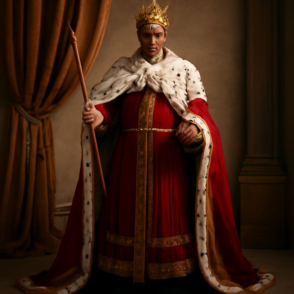
The image is a political caricature, not a literal portrait or a title Jackson held. Its central label, “King Andrew the First,” recasts the elected president as a monarch. The crown, royal robe, and scepter create an instant association with inherited rule rather than republican leadership.
Other symbols sharpen the accusation. References to the veto and the Constitution connect Jackson’s executive decisions to the charge of unlawful or unchecked authority. The royal costume enlarges the political complaint: the cartoon suggests that Jackson is not simply making a controversial decision but placing himself above the limits that should restrain a president.
Its argument depends on exaggeration and ridicule. By making Jackson look like a king, the artist invites viewers to distrust his power and reject the political program associated with it. The cartoon’s labels explain the attack, while its distorted figure makes that attack memorable.
WWII propaganda posters: audiences, purposes, and design
WWII propaganda posters addressed different audiences and asked for different forms of participation. Governments and organizations used them to recruit workers, protect military information, raise money, maintain morale, and define the enemy.
We Can Do It!, designed by J. Howard Miller for Westinghouse factories in 1943, addressed female industrial workers. The woman’s rolled sleeve, raised arm, and direct gaze communicate competence and resolve. The short slogan turns factory labor into a shared act of strength, while the tight composition leaves little room for doubt about the intended attitude.
Security campaigns used a different design. Posters built around the phrase “Loose Lips Might Sink Ships” warned civilians and service members that casual talk could help the enemy. Images of ships, listening ears, dark figures, or ominous water made an invisible risk visible. The slogan also supplies a simple call to action: remain silent.
War-bond posters targeted civilians as financial contributors. Designs for “Buy War Bonds” campaigns often placed soldiers, flags, families, or battlefield scenes beside an imperative phrase. Their purpose was not only to explain government finance but to make purchase feel like a personal contribution to military victory.
Some WWII posters also used enemy caricature, portraying Axis leaders or soldiers as monstrous, sneering, or mechanically destructive. This visual shorthand divided the world into innocent citizens and a threatening enemy, making support for the war appear morally necessary as well as practical.
Propaganda art across two eras: caricature, symbols, slogans, and action
The most important continuity is compression. King Andrew the First reduces a complex argument about executive authority to a president dressed as a king. WWII posters similarly reduce work, silence, or financial support to one strong figure, one danger, or one command.
The difference lies in how each medium persuades. The Jackson cartoon relies on caricature, irony, and explanatory labels. Its viewers must recognize the political reference and interpret the joke. WWII posters usually use brighter color, simpler shapes, and short slogans designed for mass circulation. Their figures are often idealized heroes or clearly marked enemies rather than one politician transformed through satire.
The call to action also becomes more direct. The cartoon indirectly urges opposition to Jacksonian power, while wartime posters tell viewers to enlist, work, keep information secret, or buy bonds. In both eras, symbols make the argument memorable; across the two eras, slogans and repeatable poster design make participation feel immediate.